Project Overview
A website and app concept for Volt Fitness that encourages community and team building by gamifying fitness. This approach keeps the user engaged and working towards their goals while also being encouraging and uplifting.
Busy professionals often struggle to maintain a consistent fitness routine. I wanted to create a digital experience that could adapt to the user’s schedule and lifestyle, removing barriers to entry and encouraging long-term engagement.
Design a mobile fitness experience that supports busy professionals in maintaining a healthy lifestyle by providing accessible, motivating, and personalized workout routines.
My work included user interviews, persona creation, usability testing, wireframing, and creating both low- and high-fidelity mockups in Figma.
Understanding the User
I began by identifying key characteristics of Volt Fitness’s user base. For this particular project we used AI to provide a uer persona for us to work from. Through this, I learned that many potential users lead fast-paced lives, often juggling work, social obligations, and family life. There was a definite need for a flexible, intuitive fitness solution.
I used a combination of classroom discussions and AI to better understand users’ behaviors, goals, and frustrations with existing fitness platforms, and what I could design to fill the gap.
Alex and similar users often don’t have a consistent schedule, making it hard to plan workouts in advance or stick to rigid routines.
Generic workouts felt impersonal and failed to adapt to fluctuating energy levels or time constraints.
Users needed a way to personalize how they track their progress data to fit their individual goals.
Users often dropped off after the initial excitement wore off. The experience had to be motivating long-term.
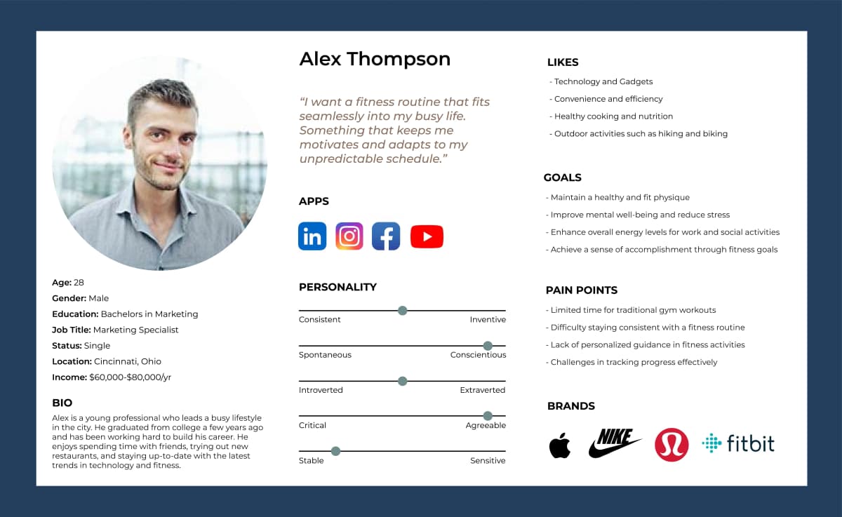
I created a primary persona named Alex Thompson, a 32-year-old marketing manager with a demanding job. Alex wants to stay fit but finds it difficult to make time for traditional workouts. Alex values efficiency, personalization, and tech-savvy tools that fit into a packed schedule.
We hosted a collaborative workshop using Miro where we generated "How Might We" statements. Virtual sticky notes and class voting allowed us to narrow down challenges and hone in on the pain points we wanted to address for the user.

We hosted a collaborative workshop using Miro where we generated "How Might We" statements. Virtual sticky notes and class voting allowed us to narrow down challenges and hone in on the pain points we wanted to address for the user.
Initial ideation and brainstorming led to rough layout ideas that prioritized user goals. I explored layout directions that put quick-start features and personalized workouts front and center.

Based on early feedback, I refined the concepts and added more interactive elements, like progress tracking and adaptive workout suggestions.

User Centered Design
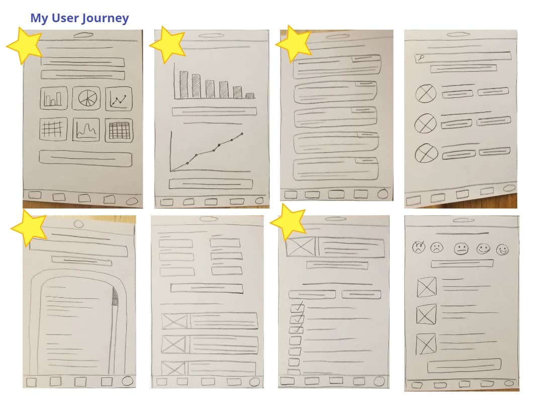
Using the Crazy Eights method, I explored rapid ideas for homepage layouts, onboarding flows, and workout tracking interfaces. This helped me focus on quantity over perfection early in the process.
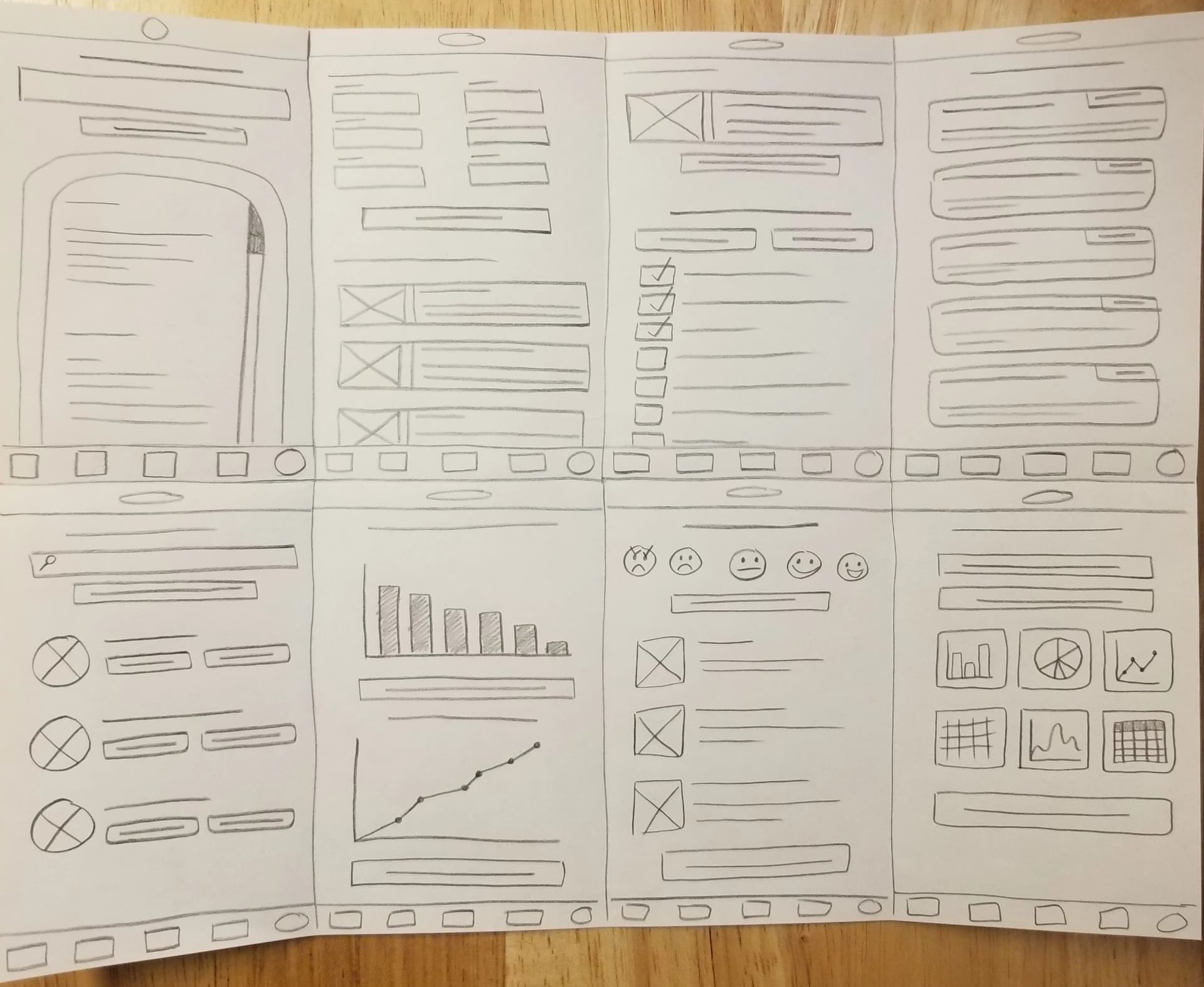
As a class we conducted user testing by creating a user journey that we felt was intuitive to us. This highlighted moments of friction, like confusing navigation or overwhelming layouts, and led to us choosing 5 screens to mockup for this project.

Change the meals page icon to something outlined to better balance the icons cohesive look.
Put describing text under the icons in the bottom nav bar to better describe where the user will go if they click on it.
Add a hamburger menu to the top with more in depth menu descriptions.
I created a low-fidelity prototype of the mobile app in Figma. It included screens for workout selection, meal plans, community challenges, and progress tracking. This version allowed me to quickly gather feedback before investing time into visuals and polish.
Designing For The Web
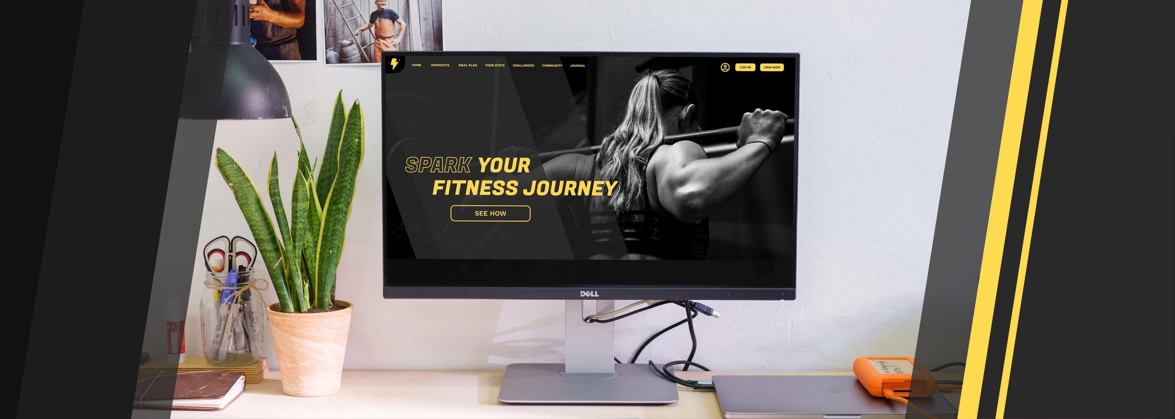
I wireframed the desktop version, focusing on clean layouts and intuitive navigation. I really wanted it to feel like a fitness brand, so I chose a color palette that felt intense.

Used high-contrast colors and legible fonts for better readability.
Prioritized usability when creating the layout and hierarchy for the website to ensure it was easy, intuitive, and efficient to use.
Was thoughtful about the images chosen to showcase people of all races, gender, age, and body types.
Going Forward
The final prototypes presented a professional, user-first experience that felt personal, flexible, and encouraging. My classmates and instructor responded positively to the experience during final critiques.
This project helped me sharpen my user research and testing skills. I learned how to synthesize feedback into meaningful design decisions and present my work effectively. This project was also a good lesson in how to design accessibly for the web and how important that is.
If I were to continue the project, I’d prioritize:
- More in-depth user testing with external participants
- Adding habit-forming features like streaks and reminders
- Developing the app into a working prototype